
Tuesday, 31 July 2012
Odyssey Tower
Heres the Tower after a few tweaks as I still wasn't quite happy with it from the last few posts I did a few days ago. But finally have what I wanted and stands proud over the plaza at last!!!

Entrance Shutters
Oh here are the entrance shutters with the nice alpha maps that give it that great see throughy goodness!!!!!!!!!!!!! Really glad they worked so well as I was worried that resolution maybe an issue!


Monday, 30 July 2012

water feature
Just putting together the final touches to the plaza, going to create some buildings for the outside of the plaza to make it feel like it's in a city and add some decals here and there to lightly scuff the floors and walls up a bit. Here are a few more assets that have gone into the plaza. This is the Foutain a small water feature for the center for people to hangout at. I used the cubemap I created with a water volume to get the realistic look of the moving water in the piece. Works really in game and behaves very realistically.


Sunday, 29 July 2012
Front door
Heres r=the entrance I've adjusted the lower texture a hundred times to achieve the look I wanted but i'm happy with what I have got now Also tried to really inforce the corporate brand in the plaza and have this as the main focal point that will spill throughout the plaza. I tried to think along the lines of the enivronment design in Brink and how they said the environment should tell the story without rampping it down the audiences throat and spell it out for them so they want to explore the space.


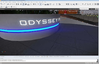
Friday, 27 July 2012
Plaza Name....
Heres the curved planter that holds to two ramps nicely together and has the name of the plaza for all to see and lead the player up to the main Odyssey Tower! The next update will be some changes I made to the entrance and the Tower having a nice night texture that was a pain to make!

Wednesday, 25 July 2012
More Posters
Just been busy pulling all the pieces together but here's a couple of quick screenshots of the posters I created last time with those great reflections!


Tuesday, 24 July 2012
Posters and Reflections
Had fun creating the designs for the posters and made up companies being showcased in the plaza. I think they work really well! I also discovered how to create a global cubemap, which means I could have everything that is reflective actually reflect the surrounding environment instead of rendering out each one and having lots of wasted memory of having alll those extra unused files. It has really made everything feel so much more realistic now and has been a great learning experience as it allows to really take my work one step closer to what I wanted to achieve.


Monday, 23 July 2012
Shops: - Branding
Tried to give the indetity to some of the shops and the brands so expanded a little for the shop fronts. I created some decals which arfe shared throughout the other shops as well as a unique one to, to help break it up. Also started work on the posters around the plaza to, more updates to follow.


Saturday, 21 July 2012
Rubbish???
Started filling up the plaza with some smaller props and assets. I designed a company called eco-cycle who are meant to recycle everything and have their bins about the place. I was quite happy with what I came up with. Max render and one in engine: -


Thursday, 19 July 2012
Ramp
Put the front ramps in leading up to the entrance of the plaza. I used the floor lights I made to illumninate the ramp and draw the player in. I also made the floor reflective as well to simulate the effect of polished concrete.


stairs
Got the stairs in properly so I could actually stop having to do a crazy jump up the first tier!!!! Made some little glow strip lights on them to.


Wednesday, 18 July 2012
some more graphics
Made some more designs for company branding and those corporation style names. Added one to the textures for the shops I've been working on just not updated them on here, but will get screenshots for when they are ready.


Shops
I went on to use those graphics to create one of the shop fronts. I followed simon fuchs tutorial on making realistic glass in cryengine and found it very useful as it then dicovered from further reading how to generate my own cubemaps for my level so icould have the plaza reflected in the window and make the area more realistic. I broke the front shop section into its own piece as I wanted to lower draw calls in the level as the material would be quite expensive especially if I had teh illuminated signs attached as well. So I unwrapped some the sign ahop toppers on a sepearte texture sheet so they would have the same material and glow effect and help to tie the plaza together as places like this have very strict rules on having the same architectural style inside the area (such as santa monica place I mentioned in my earlier posts). The front looks a little plain at the moment but I'm planning on adding some decals which say "sorry, we are closed for the night - please return soon" over the front or something to that effect.


Tuesday, 17 July 2012
shop graphics
I started to design some unique graphics for the shops and create brands that could be used again on posters just to make the area feel consistant. I decided the most corporate areas need their corporate coffee chain so here's my spin a classic coffee chain! I think making graphics for projects like this are sometimes my favourite parts!!!


Saturday, 14 July 2012
planters
Made some plants and planters to add some greenary as all the plazas have them and they add something living to the scene. I felt the materials of concrete and metal were becoming quite dominant and harsh to look at so I decided to try and add some wood textures if I could later on around the plaza possibly on the walls as pieces of wall art with a corporation logo on it or something to that effect perhaps?


Friday, 13 July 2012
some lights
Just a quick post today just showing some small ground lights for the plaza based on some I saw on my trips to London around the southbank area. They look really great at night and looked very atmospheric. Though seeing as I found the glow material it would be a shame not to use them as it gave me such a good effect on the lift! Oh and I forgot to mention I had been playing with the lighting and time of day again to achieve the nice bloom effect which is noticeable with the night time of day I have set in the screen shot.


Thursday, 12 July 2012
Need a lift???
I've been working on some lift doors that will just be static, so I tried to make them more interesting by having the animated texture sign and also applying a glow effect to certain areas to give the effect their is power running through it and adds a bit of life to the scene. The glow effect was created by using the alpha channel to mask the areas i wanted to glow and that applying that mask to the glow material slot in the material editor, I foiund quite quickly that using it careful and not poushing too much was important or the diffuse texture gets washed out completely and teh bloom from the lughts becomes a little too intense.


Wednesday, 11 July 2012
Material editor
The material editor in cryengine is brilliant and easy enough to use with a little reading up on the crydev.net forums and cryengine documentation. I wanted to create some dynamic textures in my scene e.g. moving images and illuminated signs, glow for lights etc.
After reading a few things I started work on a test piece for moving textures. I posted the image with the material browser window next to it to show the tiling settings and how it moves. I found that it comes down to the way the textures are laid out so I figured that the use of multi/ sub would be necessary for these types of signs and would need their own texture space I f I wanted them to move without showing other pieces of the static uv sheet!!!!

After reading a few things I started work on a test piece for moving textures. I posted the image with the material browser window next to it to show the tiling settings and how it moves. I found that it comes down to the way the textures are laid out so I figured that the use of multi/ sub would be necessary for these types of signs and would need their own texture space I f I wanted them to move without showing other pieces of the static uv sheet!!!!

Tuesday, 10 July 2012
working on textures
I started to play around with the material editor and the textures as I wasn't to happy with the look I have at present so I decided to change it up a little and think it looks better for it though I'm still battling with the walls of the plaza as I think having the shops and other assets over them will help to define what is needed of them to make them feel more realistic. I also want to try and avoid having my level looking to white as it seems to be slighty too monochrome (even though the area is obviously meant to be relatively clean and shiny, much like zaha hadids architectural works) but I think I'll wait to let the environment progress and see how everything sits before making any rash decisions.


Saturday, 7 July 2012
Pulling it together
The pipleine has been really great to work with as it allows me to seamlessly flow between max and the editor. I'm starting to put all the main structures in now all the uv's have been properly sorted so they tile efficiently and the materials have also been set up and exported to which now means I can start filling the main area up!!!


Wednesday, 4 July 2012
Lighting with assets
Heres the skscraper with a place holder texture as the replace me textures were getting rather annoying!!!!! But the main reason for this post is to show of the lighting i'm happy with!!! I want to ad in some clouds and other things to fill the sky up a bit and make it feel more real but that can come later. With the time of day setting I also managed to get the top of the skyscraper to start blurring out as well from the player perspective to add that sense of scale.


Tuesday, 3 July 2012
Solutions and a bit of lighting
I've spent the last few days or so working on figuring the lighting out and playing around with the settings and graphs. I've really enjoyed some of the flexibility with the options it gives and makes the engine very versatile to use, in terms of getting the look you want from it! Here's a screen shot of me working on the lighting and the Time of Day settings. I've actually managed to achieve a much better lighting I had after reading more into the documentation.


Subscribe to:
Comments (Atom)